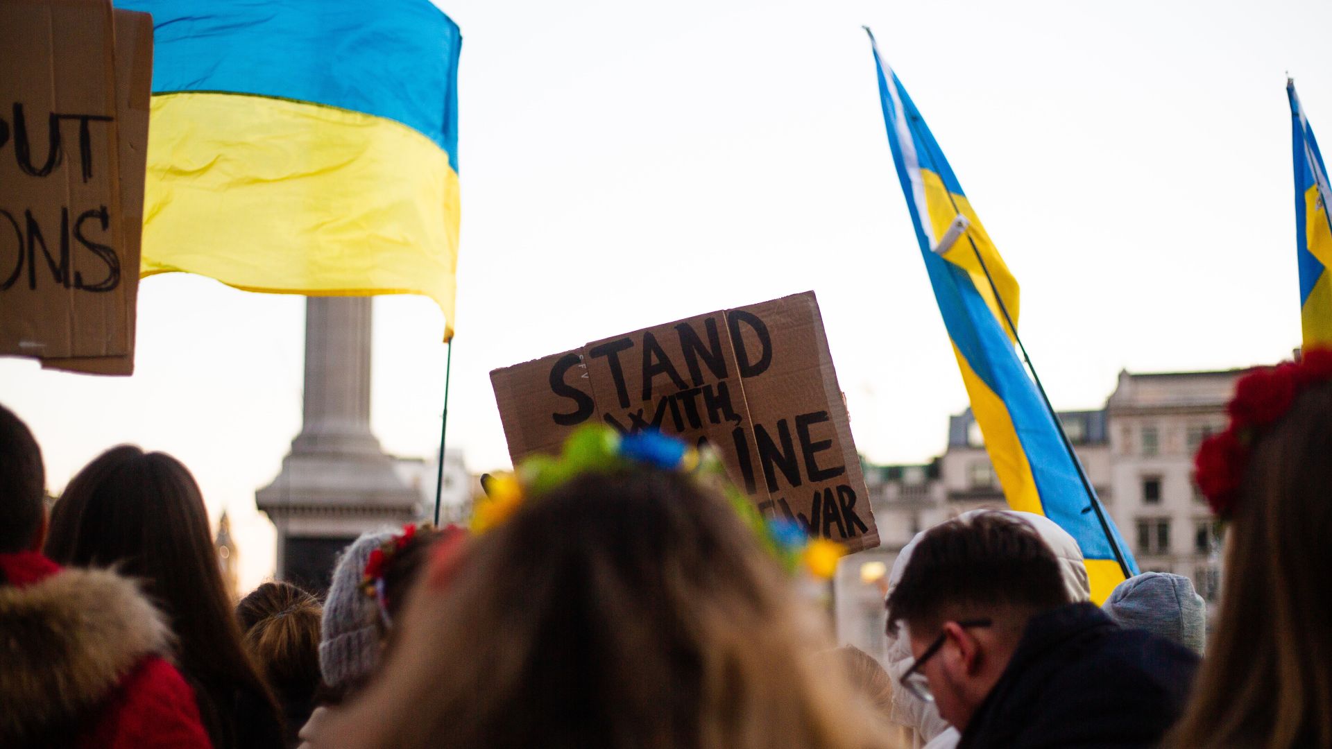
‘As of 29 June, 5,493,437 refugees have fled Ukraine. The European Union’s humanitarian commissioner, Janez Lenarčič said, “Eighteen million people will be affected in humanitarian terms.”’
This is the opening to The ONE Campaign’s latest Data Dive, which looks at how the crisis in Ukraine will affect already-dire food shortages on the African continent. The task – connecting a headlining humanitarian crisis to disasters or challenges with less media coverage, despite often greater implications for human life – is one of the most difficult tasks public-facing international development organisations encounter. It’s relatively common knowledge in the aid sector that climate change affects migration, that WASH affects girls’ education, that infrastructure affects maternal and infant mortality (the list goes on), but how do you connect these dots for the public? This era of scattered attention and a frenetic media spotlight makes it difficult, particularly when decades of appeals have conditioned donor publics to respond to one crisis at a time, then forget about the issue until next crisis.
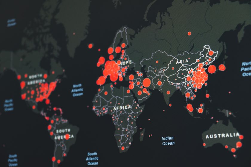
The ONE Campaign’s ongoing Data Dive series is taking a new approach. By visualising real-time data to explain complex issues, the team at ONE are attempting to bridge the gap between what’s happening on the front page and the broader connectedness of global crises. The Development Engagement Lab spoke with David McNair, Executive Director for Global Policy, about the thinking behind the Data Dive, what ONE is learning from the initiative, and how it’s changing their approach to engaging with the public. Lessons abound for communicators who are also looking for new ways to connect the dots.
Can you talk a bit about how the Data Dive came about? What issues were foremost in your mind when you set out to gather the data?
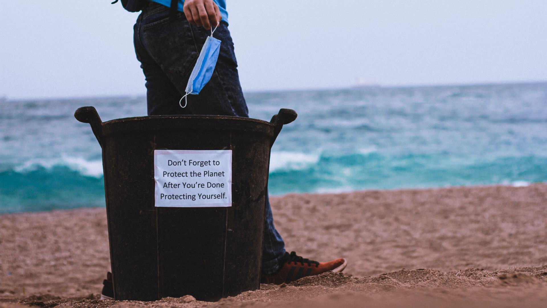
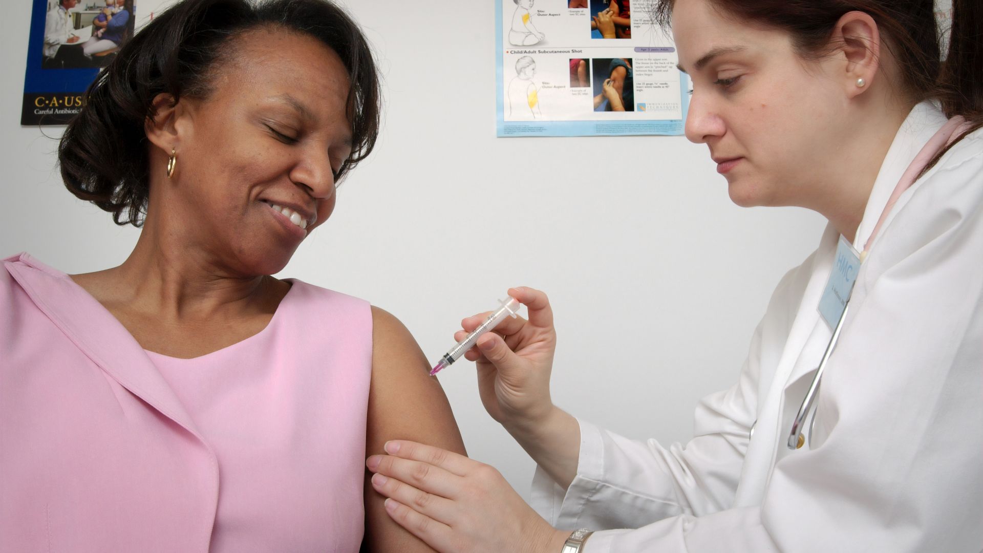
The Data Dive on Food Security is the latest in a series – we’ve covered a plan to avert the debt crisis, the unequal vaccine rollout, How Russia's invasion of Ukraine will impact Africa as well as more technical issues such as Special Drawing Rights.
Our aim to have a suite of go-to pages that both explain the issues in clear and simple terms, but also provide the latest data that automatically updates so that journalists, advocates, and those interested can always find the latest data for briefings, articles etc.
It was borne out of a realisation that we were doing so much analysis behind the scenes but very few people were using it – either because we weren’t getting it out there, it was in long reports that people weren’t reading, or it was too filled with jargon. I really believe that clarity and explanation of the implications of these issues is so important.
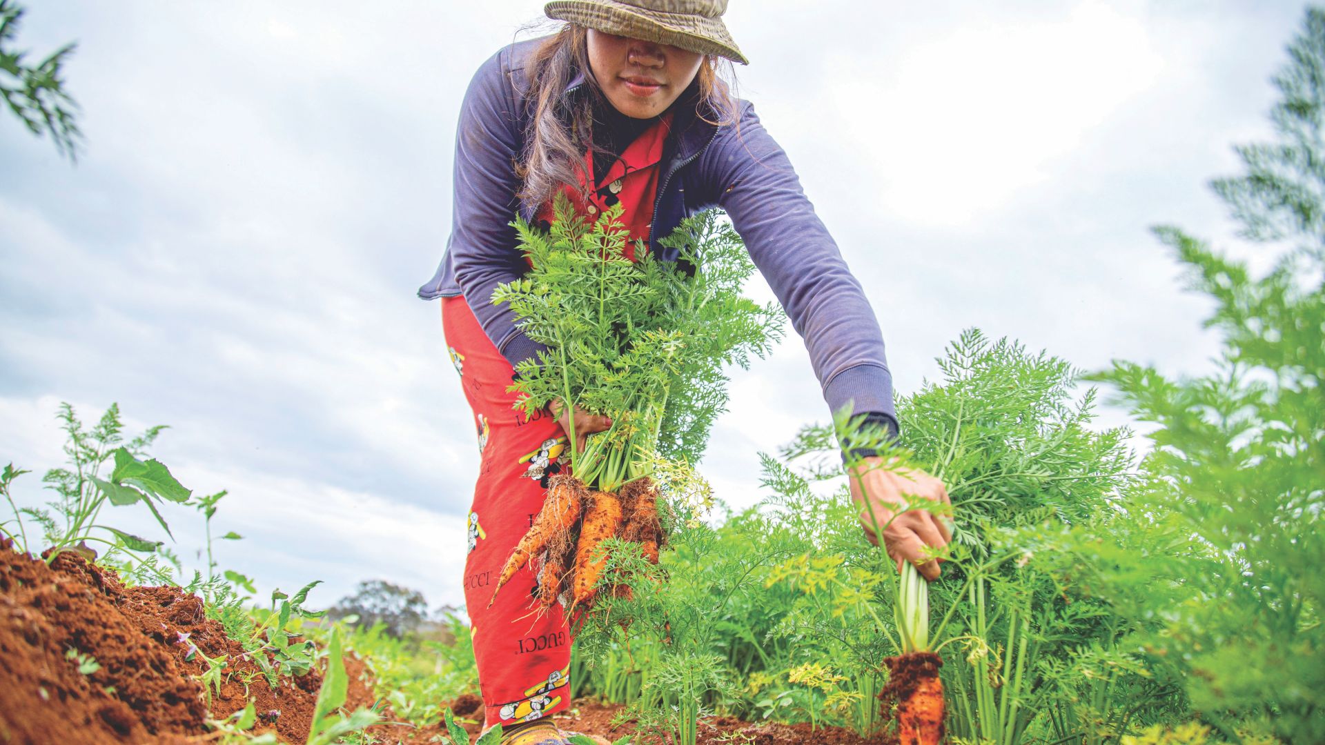
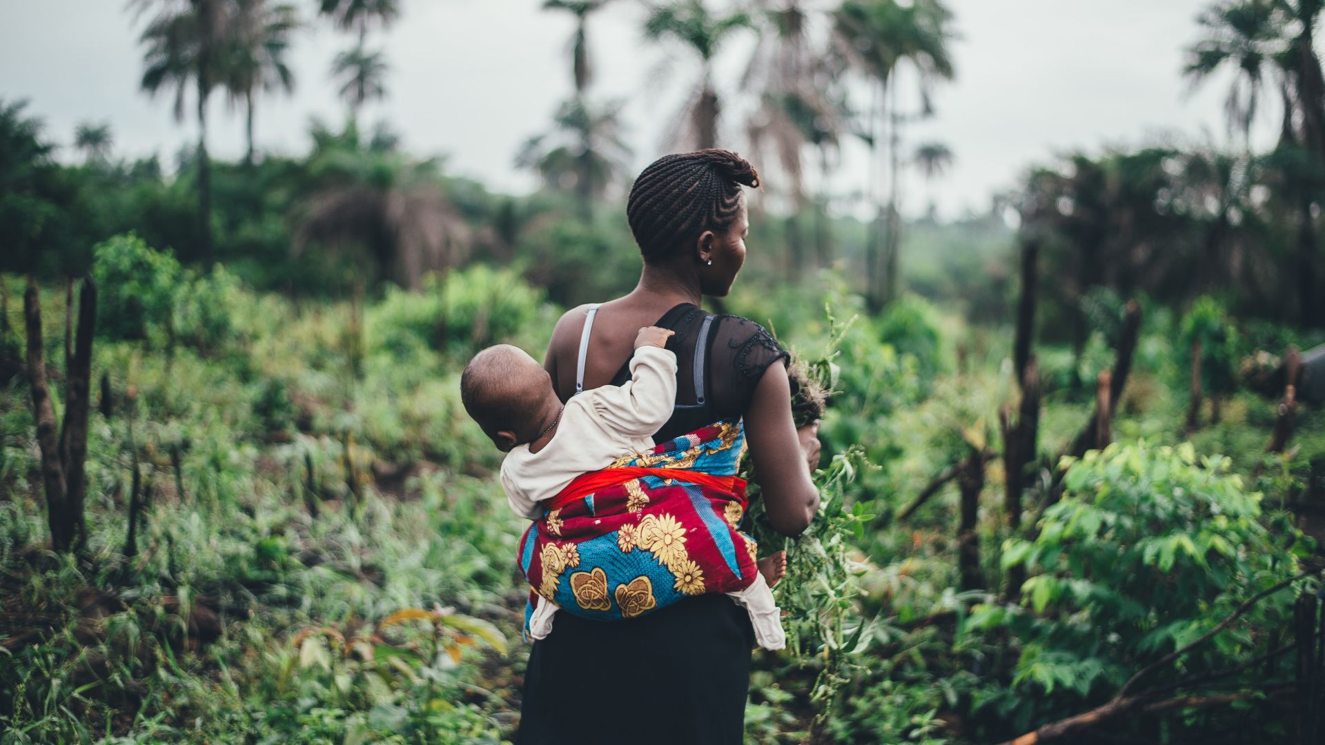
On food security, we wanted to explain the issues – but when we got into the details we realised it was both highly technical but also somewhat contested. There are many different definitions of hunger and much of the excellent data is quite impersonal and impenetrable.
We wanted to first remind the reader that hunger is a horrific personal experience faced by far too many people, before explaining how many people are affected and what’s driving it. It’s the definition of a complex system – and we wanted to get across the harm that will be done if we don’t respond to the humanitarian and long term needs – but also if we do respond in harmful ways such as imposing export bans.
How did you acquire the data?
We first spoke to experts and read the key reports on food insecurity and nutrition. As we got into the details we also started to investigate some of the technical issues such as International Food Policy Research Group’s excellent work on export bans.
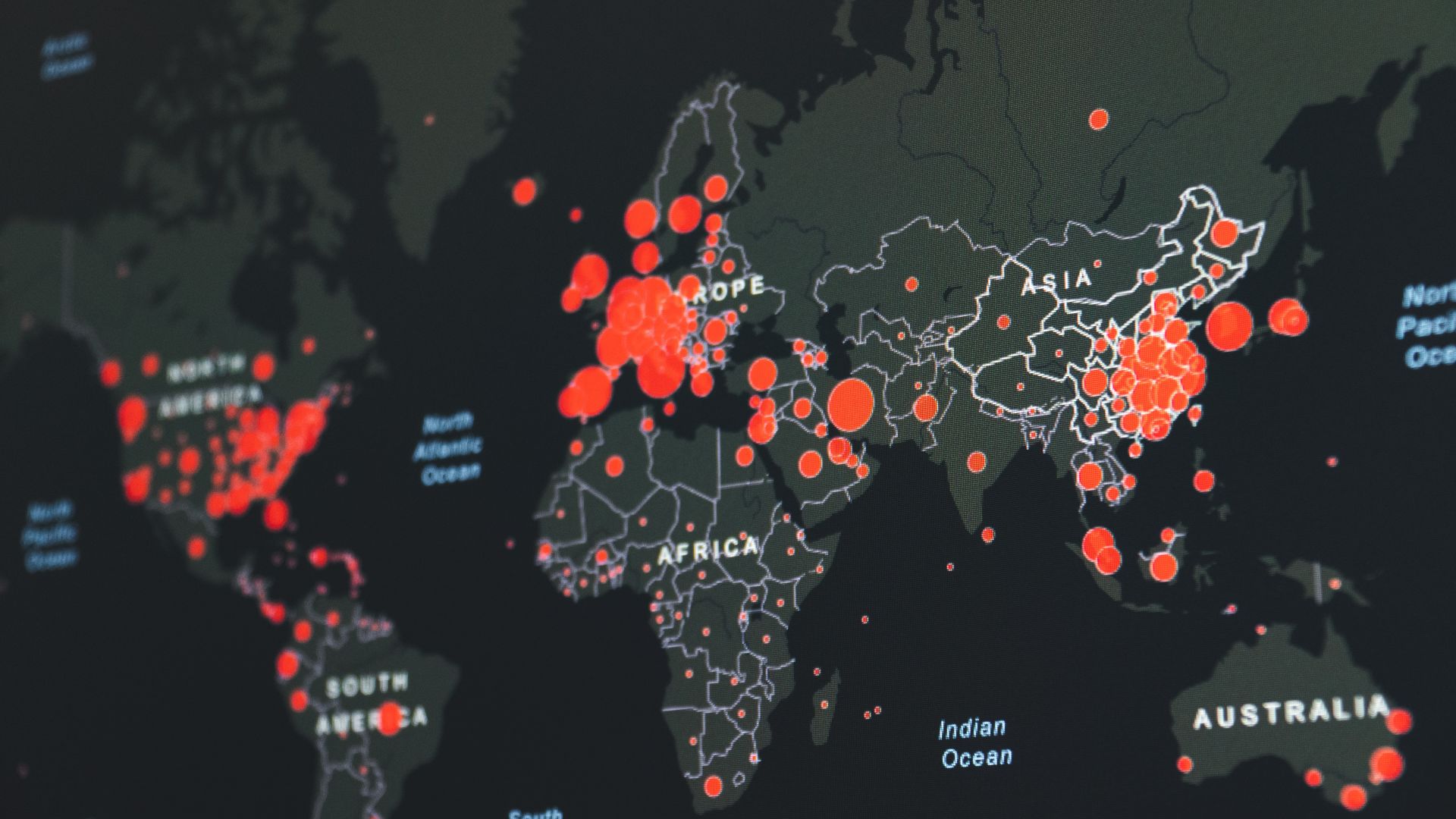
In some cases we scraped data from key reports such as, the World Food Programme’s Hunger Map, The Food and Agriculture Organisation’s Food Security Index. We pulled data from the World Bank and the U.S. Department of Agriculture and explored the option of using satellite data to show the impact of the war on shipping but access to the images proved tricky. The Guardian did that brilliantly here.
How, if at all, did the project change from conception to launch?
Food security is such a complex issue and there were many fascinating rabbit holes we went down, for example exploring the academic evidence on the links between hunger and instability throughout history. But ultimately we needed to focus in on the key elements where we had access to data but also that pointed to the core issues that our audience needed to know.
Are there plans already in place for future data dives? Evolutions of this one?
We had already produced a data dive on the various dominoes that are likely to fall in the wake of Putin’s invasion - from a lack of attention on the COVID-19 pandemic (that is still ongoing by the way), to pressure on aid, food security, the way inflation could push up the costs of debt in vulnerable countries and the geopolitics of the UN General Assembly votes condemning Russia.
We just published a data dive on building a pharma sector in Africa, and are working on similar projects on the opportunities and risks of climate change for Africa, gender and social inclusion and job creation on the African continent.
Can you talk a bit about the tool's reach/audience, so far? Who has found it most useful? Any surprises in how it's being used?
Yes, we track the data on these religiously to see what’s working, and where we need to course correct. Since Putin’s invasion, our data dives have been used almost ten thousand times with the average person staying four and a half minutes.
We know that ONE’s teams and partners are using the information, but we know a number of high profile journalists that have used the information - which we are delighted by. We would love feedback and suggestions for producing new material that others would find useful. By design the back end of our data, the visualisations are all freely available if others would like to make use of the information.
It feels like the world is out of control sometimes. If we can explain the complexity of these big issues in ways people can understand, and they can see the entry points for how they can make a difference, I believe that will unlock huge potential changing things for the better. And if we can help others do that, we would be delighted to.
To sign up for The ONE Campaign's weekly newsletter, go to ONE.org/Aftershocks.